
Numerator Ad Intel
An ad tracking platform that searches across all media channels and media types that helps clients understand the competitive market and effectiveness of advertising.
Client
Web app
Service
User Experience (UX) Design
Date
2021

Project Overview
Build a new report for creative messaging in digital ads
Within the B2B2C space, Numerator helps companies understand their customers by providing unique insights and proprietary data for the market research industry through their Saas business intelligence platforms.
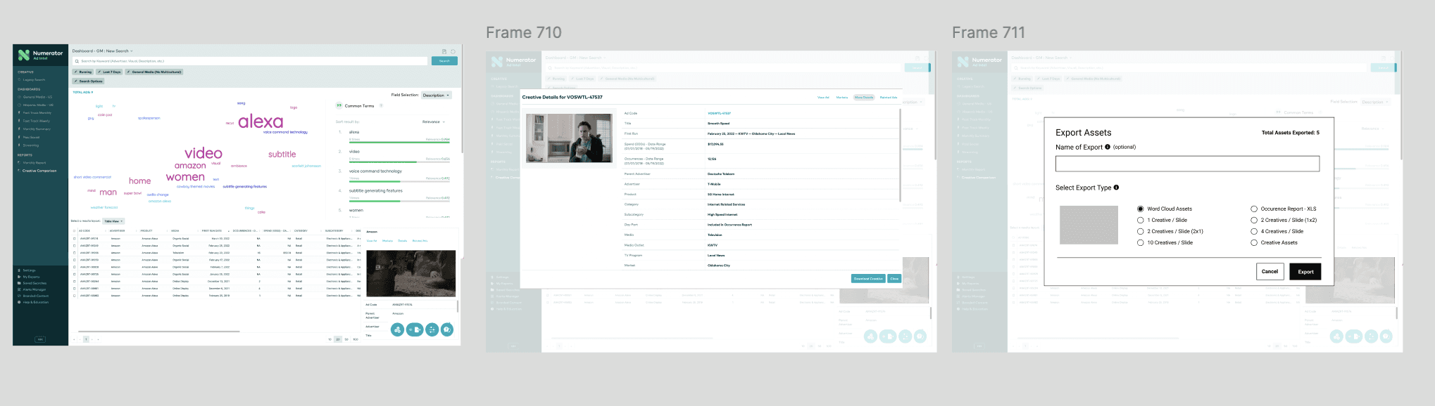
Ad Intel wanted to introduce a new report, specifically designed for brand teams and agencies. This comprehensive report would enable a business opportunity of obtaining easy insights through competitive messaging. Our product team was tasked to develop an experience that offers a comparative data of trending buzzwords in digital advertising, essentially a word cloud feature, equipped with the insights necessary to maintain a competitive advantage and improve their campaigns strategies.
Designing from end-to-end
As the UX designer for this project, I was involved in every stage, from conducting user research to delivering the final designs for implementation. I focused on understanding both new and returning user needs and translating those insights into effective design solutions that improve the overall user experience. I collaborated with a product manager throughout the whole design process and an engineer during the testing stage.
Finding inspiration in comparative analysis
In creating our word cloud report for Ad Intel, I drew inspiration from various tools such as Tableau, WordItOut, MonkeyLearn, and R. I carefully examined how these platforms utilize this specific data to benefit their users. This research helped shape our approach, as we wanted to build a report that is both informative with a seamless experience.
Tableau is a powerful data visualization tool demonstrates how to upload pre-packaged data into the word cloud generator. WordItOut supports emojis and special characters, which opens up more possibilities in creative messaging.
Usability testing with our users
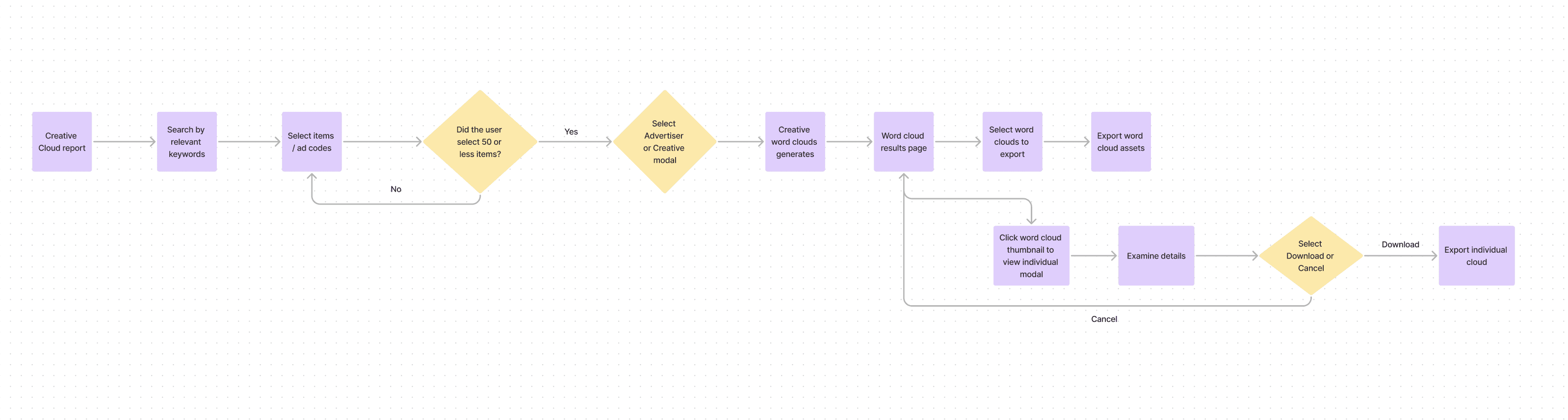
I collaborated closely with a product manager to create a streamlined flow using quick sketches and wireframes of an individual word cloud generator that organizes words by frequency. By conducting usability testing with a small group of users, we gathered valuable feedback early in the process. This proactive approach helped us identify potential issues, iterate early on, and avoid larger errors as we moved forward.
Learnings from our usability testing:
Most users thought that the word cloud would help them save time in their process of obtaining competitive data.
Most users thought that word clouds help build credibility on their insights for clients.
They suggested comparing word clouds among individual ads and among advertisers separately.
It would be helpful to show multiple word clouds at a comparative level, rather than looking that them individually.
Some users wanted a more customizable view, by tweaking the colors and organizing by rank or frequency.
Based on the insights and feedback gathered from our users, it was clear that we needed to refine and address these suggestions in our task flow. We wanted to make sure that this new report aligned with their expectations as close as possible.
Brainstorming and tweaking the task flows
As we developed task flows for the report, we identified discrepancies and interruptions stemming from insufficient existing data. This complexity led to confusion, particularly as we encountered exceptions to the established rules. At one point, we found ourselves deviating from our original intent, highlighting the need for clearer data and guidelines.
We prioritized which flows took precedence and in building a new report, simplicity and a refined experience is key, despite its complex challenges. We shifted our focus on the main tasks: creating a set of word clouds and exporting them. Because we changed our approach and focused on building one flow, we were able to make our changes to the report more scalable in future iterations.
Iteration: rinse and repeat
During the development of designing prototypes, we met weekly with not only our users, but also engineers to gather more feedback, whether it be minor changes to the UI or a technical change due to uploading pre-packaged data. This meant more usability testing with new users and returning users who have witnessed the progress over time. By doing so, we gathered a lot of perspective during the iteration phase and addressed the main user needs.
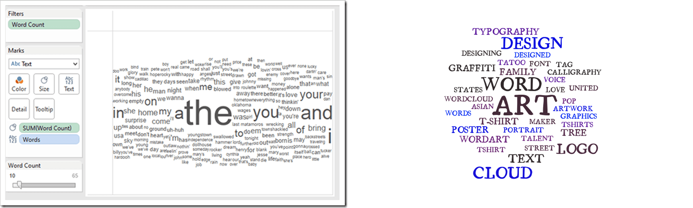
One of the biggest pieces of feedback we received was the low visibility of certain words in the word cloud. This was a significant concern, as the inability to clearly see the words undermines the purpose of the report. To address this, I adhered to the WCAG 2.1 accessibility standards, adjusting the colors to enhance contrast and improve visibility. Additionally, I ensured that the font size and typeface were appropriate, opting for a bold font to create a stronger contrast against the white background, making even the smaller words more legible.
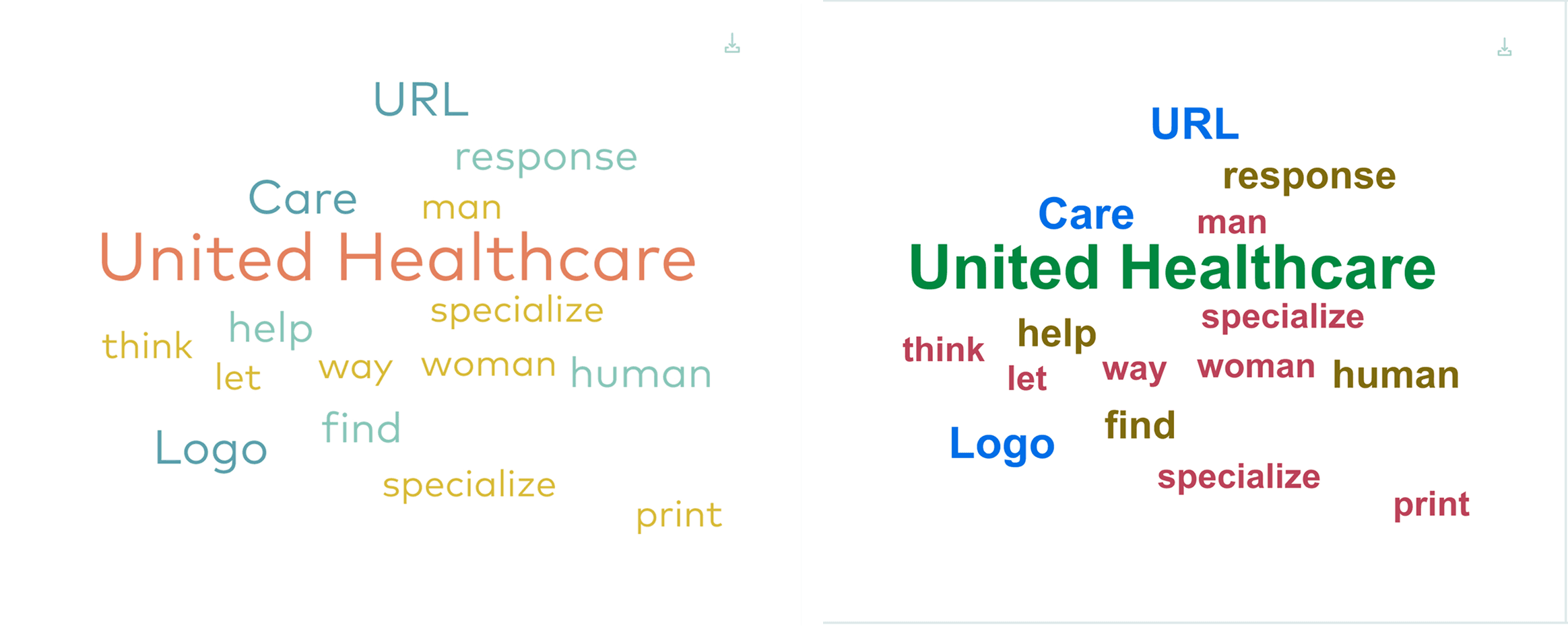
Word clouds before and after (left to right).
Word cloud before color and typeface adjustments:
colors did not meet accessibility standards and faded into the background
typeface was not appropriate for data graphic
Word cloud after color and typeface adjustments:
colors tweaked to meet accessibility standards and higher contrast
typeface changed and bolded for easier visibility
Brainstorming and tweaking the task flows
As we developed task flows for the report, we identified discrepancies and interruptions stemming from insufficient existing data. This complexity led to confusion, particularly as we encountered exceptions to the established rules. At one point, we found ourselves deviating from our original intent, highlighting the need for clearer data and guidelines.
We prioritized which flows took precedence and in building a new report, simplicity and a refined experience is key, despite its complex challenges. We shifted our focus on the main tasks: creating a set of word clouds and exporting them. Because we changed our approach and focused on building one flow, we were able to make our changes to the report more scalable in future iterations.
Iteration: rinse and repeat
During the development of designing prototypes, we met weekly with not only our users, but also engineers to gather more feedback, whether it be minor changes to the UI or a technical change due to uploading pre-packaged data. This meant more usability testing with new users and returning users who have witnessed the progress over time. By doing so, we gathered a lot of perspective during the iteration phase and addressed the main user needs.
One of the biggest pieces of feedback we received was the low visibility of certain words in the word cloud. This was a significant concern, as the inability to clearly see the words undermines the purpose of the report. To address this, I adhered to the WCAG 2.1 accessibility standards, adjusting the colors to enhance contrast and improve visibility. Additionally, I ensured that the font size and typeface were appropriate, opting for a bold font to create a stronger contrast against the white background, making even the smaller words more legible.
Word clouds before and after (left to right).
Word cloud before color and typeface adjustments:
colors did not meet accessibility standards and faded into the background
typeface was not appropriate for data graphic
Word cloud after color and typeface adjustments:
colors tweaked to meet accessibility standards and higher contrast
typeface changed and bolded for easier visibility
Key learnings & next steps
Simplicity = scalability
At one point during the brainstorming, it became overwhelming to see all potential task flows that this report can do. We were losing sight of why we were building it in the first place. By simplifying the flows down to the most basic need for this project, we were able to not only manage realistic expectations for our timeline, but also construct a design that fulfilled that user need. It set the foundation for building new designs around it, without compromising the main task flow.
Early iteration was crucial for this project
The word cloud report was tailored for a specific audience, namely brand teams and agencies. Engaging with these users throughout the entire process was crucial to prevent any potential issues down the line. Their insights and feedback played a vital role in shaping the final designs.
Go Back

